A BETTER ECOMMERCE STOREFRONT BEGINS WITH CLEARER CHOICES
How navigation, merchandising and useful product information can improve the experience of shopping your own store.
By Lacore Commerce · Commerce insights
Make the range understandable
A store’s navigation should help customers make sense of the assortment. Consider the needs, routines or product categories that are meaningful to the person shopping. Internal naming conventions are not always the clearest customer labels. Review the path from the homepage into collections and individual products, then identify where a visitor needs more context.
Give product pages a practical job
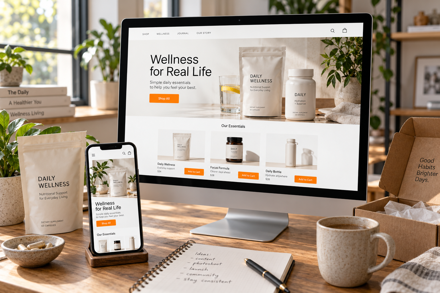
A product page should explain what the product is, who it suits and how it is used, with accurate information and approved claims. Photographs should help answer those questions rather than simply fill space. Compare the story across titles, descriptions, images and options. Contradictory or incomplete information creates unnecessary uncertainty.
Design for the team that runs the store
Merchandising and content will change after launch. Define who updates products, maintains collections and approves promotions. A design that is easy to maintain helps the brand keep the experience consistent as the assortment grows. The daily operating process is part of the storefront’s long-term quality.
Improve with a question in mind
A useful improvement starts with a business question: are customers finding the right product, understanding the difference between options or getting the information they need? Review the available evidence, make focused changes and evaluate what follows. The method should fit the traffic and data available. The goal is a clearer customer experience and better decisions about what to improve next.